Screen Resolution Checker: Test Display Resolution, PPI, DPR, Pixels and Screen Quality
Your screen resolution affects far more than the number shown in Windows or macOS display settings. It determines how many pixels are available for text, images, games, videos, windows, and every other visual element on your display.
However, checking resolution is not always as simple as reading a number such as 1920×1080. Modern operating systems, high-density displays, browser scaling, Retina screens, multi-monitor setups, and different aspect ratios can cause several different measurements to appear at the same time.
The Checker.Free Screen Resolution Checker is designed to analyze these values directly in the browser. It reports logical screen resolution, browser viewport size, device pixel ratio (DPR), aspect ratio, estimated physical equivalent, color depth, estimated refresh rate, pixel density, and other display information.
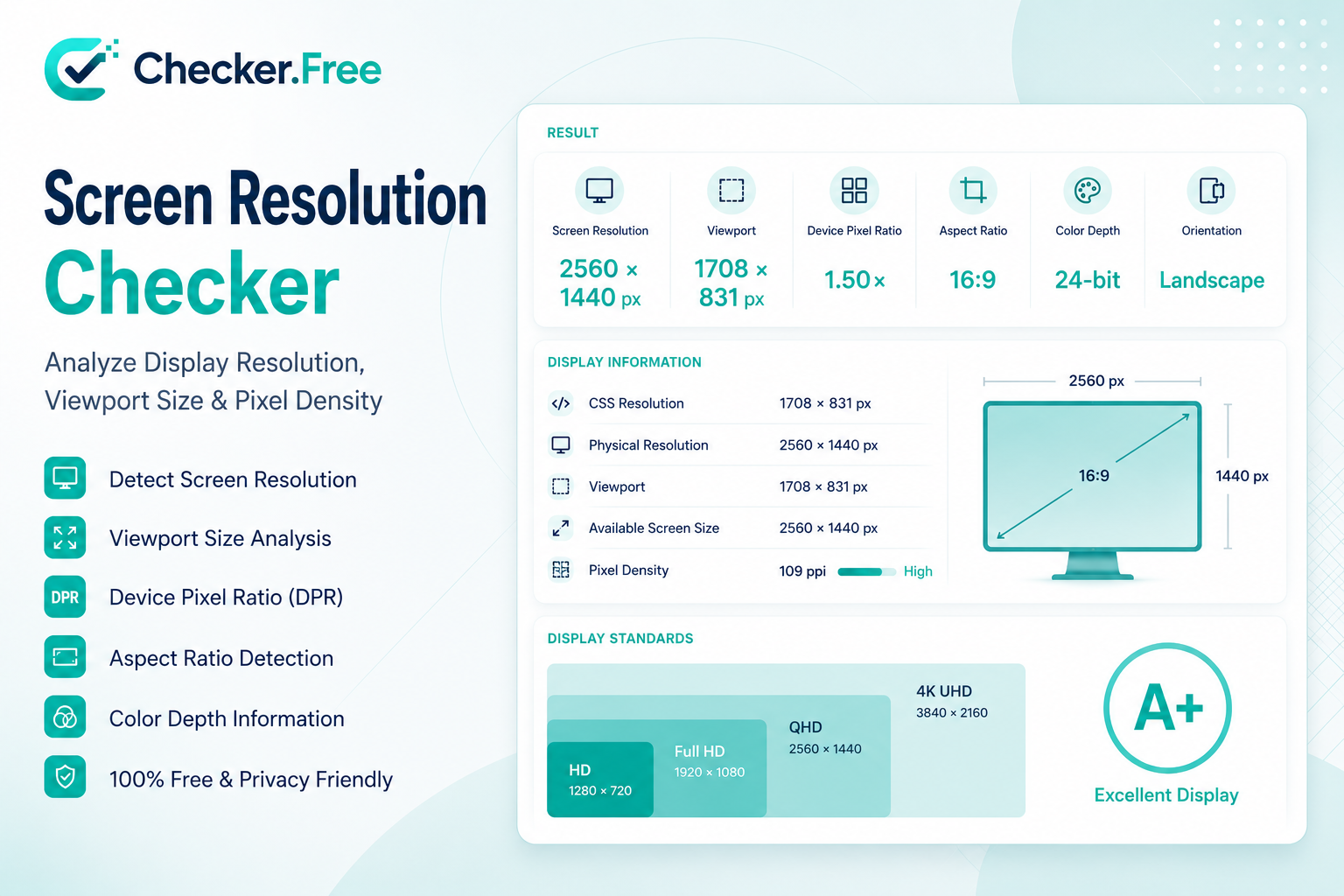
The tool also includes fullscreen testing, pixel and sharpness patterns, scaling and DPI analysis, resolution comparisons, display diagnostics, and a searchable resolution standards database.
What Is Screen Resolution?
Screen resolution describes the number of discrete pixels arranged horizontally and vertically across a display.
For example:
1920 × 1080
means the display signal contains:
1,920 pixels horizontally
1,080 pixels vertically
2,073,600 total pixels
approximately 2.07 megapixels
The general formula is:
Total Pixels = Width × Height
Higher resolution increases the amount of spatial information that can be represented. This can provide more detailed images, sharper text, and more room for multiple windows.
But higher resolution also increases the amount of work required from the GPU, particularly in games and other graphics-intensive applications.
Screen Resolution vs Browser Viewport
One of the most important concepts when testing a display is understanding that screen resolution and browser viewport are not the same thing.
Screen Resolution
Screen resolution represents the dimensions exposed for the display environment, such as:
1920 × 1080
Browser Viewport
The viewport is the area actually available for a webpage inside the browser window.
Browser tabs, address bars, bookmarks, sidebars, scrollbars, developer tools, and operating-system interface elements can all reduce the viewport.
For example, a monitor may report:
1920 × 1080
while the browser viewport may be closer to:
1920 × 960
The Checker.Free analyzer displays both values separately, making it easier to understand why websites sometimes appear to have fewer available pixels than the monitor's advertised resolution.
What Is Device Pixel Ratio (DPR)?
Device Pixel Ratio, commonly abbreviated as DPR, describes the relationship between CSS pixels used by web pages and physical display pixels.
A DPR of:
1.00x
generally means one CSS pixel corresponds to one device pixel in the browser's rendering model.
A DPR of:
2.00x
means a CSS pixel can be mapped to a higher-density physical pixel grid.
This becomes especially important on high-density displays.
For example, a 4K display running with 200% scaling may expose an effective logical workspace closer to:
1920 × 1080 CSS pixels
while the physical panel still contains:
3840 × 2160 pixels
This is why someone can own a 4K display and still see 1920×1080 reported by a browser.
The source page specifically explains that browsers work with logical CSS pixels and use DPR to map those dimensions to higher-density rendering.
Why Does My 4K Monitor Show 1920×1080?
This is one of the most common questions about screen-resolution testing.
The reason is often display scaling.
For example, with 200% operating-system scaling:
Physical panel: 3840 × 2160
Logical CSS space: 1920 × 1080
DPR: 2.00x
The browser uses the logical dimensions for layout so that menus, text, buttons, and other interface elements remain usable rather than becoming extremely small.
This does not mean the monitor has suddenly become a 1080p panel. It means the software layer is representing the higher-density screen through a scaled coordinate system.
Native Resolution vs Current Resolution
Another important distinction is between native resolution and the resolution currently being used.
Native resolution is the physical pixel matrix built into the panel.
For example, a monitor may have a native resolution of:
2560 × 1440
but the operating system can send it a different mode such as:
1920 × 1080
The latter is the active display mode, not the physical structure of the panel.
Running a flat-panel display below its native resolution can require interpolation, where the GPU or display scales image information across the physical pixel grid. This may make text and fine details look softer.
The page's diagnostic explanation distinguishes the native physical matrix, active display mode, and browser-estimated physical equivalent.
What Is PPI?
PPI, or Pixels Per Inch, describes the density of physical pixels on a display.
It is particularly useful when comparing screens with different physical sizes.
Two monitors can have the same resolution but different PPI.
For example:
1920 × 1080 @ 24"
has a higher pixel density than:
1920 × 1080 @ 27"
because the same number of pixels is spread across a larger physical area.
The tool includes a PPI calculator where you enter your monitor's diagonal size to calculate pixel density and dot pitch.
PPI vs DPI
These terms are often confused.
PPI — Pixels Per Inch
PPI describes the density of pixels on an electronic display.
DPI — Dots Per Inch
DPI traditionally describes physical dots used in printing and is also widely used when discussing mouse sensor sensitivity.
For monitor sharpness, PPI is the more precise term.
The page explicitly separates screen PPI from printer and mouse DPI and links the latter to Checker.Free's DPI Checker.
How Is Monitor PPI Calculated?
The Checker.Free analyzer uses the diagonal pixel count and the physical screen diagonal.
The formula is:
PPI = √(Width² + Height²) ÷ Diagonal Inches
For a 27-inch 2560×1440 display:
√(2560² + 1440²) ≈ 2937.21 pixels
Then:
2937.21 ÷ 27 ≈ 108.79 PPI
This gives an approximate density of 108.79 pixels per inch.
The page also calculates dot pitch using the relationship between physical pixel spacing and PPI.
Resolution and PPI Examples
Here are examples included in the page's display-density reference:
| Resolution | Screen Size | Approx. PPI |
|---|---|---|
| 1920×1080 | 24" | 91.79 PPI |
| 1920×1080 | 27" | 81.59 PPI |
| 2560×1440 | 27" | 108.79 PPI |
| 3840×2160 | 27" | 163.18 PPI |
| 3840×2160 | 32" | 137.68 PPI |
| 3440×1440 | 34" | 109.68 PPI |
These examples demonstrate why resolution alone does not completely describe perceived sharpness. Physical display size matters too.
1080p vs 1440p vs 4K
Resolution comparisons become easier when looking at total pixel count.
1080p — Full HD
1920 × 1080
≈ 2.07 megapixels
1080p remains a common resolution for general desktop use, streaming, laptops, and gaming.
1440p — QHD
2560 × 1440
≈ 3.69 megapixels
1440p provides substantially more pixels than 1080p and increases workspace and image detail.
4K UHD
3840 × 2160
≈ 8.29 megapixels
4K contains four times as many pixels as 1080p.
That increased pixel count can provide sharper text, finer image details, and more desktop workspace, but it can also substantially increase GPU workload in games.
The page identifies 1080p as 2.07MP, 1440p as approximately 3.69MP, and 4K as 8.29MP.
Does Higher Resolution Reduce Gaming FPS?
In graphics-intensive applications, yes, higher resolution can increase GPU workload.
A 1080p frame contains roughly 2.07 million pixels.
A 4K frame contains approximately 8.29 million pixels.
That means a 4K image contains four times the number of pixels of a 1080p image.
The GPU therefore has significantly more pixel data to process for every frame.
This is one reason gamers may lower resolution or use technologies such as resolution scaling when trying to increase FPS.
For a separate rendering-performance test, use the FPS Checker.
Ultrawide Resolutions
Not every display follows the traditional 16:9 aspect ratio.
Common ultrawide formats include:
2560 × 1080 → 21:9
3440 × 1440 → 21:9
5120 × 1440 → 32:9
Ultrawide displays provide additional horizontal workspace.
This can be useful for:
Side-by-side applications
Video editing timelines
Programming
Productivity
Simulation games
Racing games
Wider game environments
The page describes 21:9 and 32:9 displays as ultrawide and super-ultrawide formats.
Aspect Ratio and Why It Matters
Aspect ratio describes the proportional relationship between width and height.
For example:
1920 / 1080 = 16:9
Other common formats include:
16:10
21:9
32:9
A 16:10 display provides more vertical workspace than a similarly wide 16:9 display.
The additional height can be useful for documents, programming, spreadsheets, and websites because more content can fit vertically before scrolling becomes necessary.
Aspect-ratio mismatches can also create black bars when content is designed for a different format.
The Fullscreen Resolution Test
Checker.Free includes a Fullscreen Test that compares normal windowed measurements against the browser's fullscreen state.
It reports values such as:
Normal screen size
Available screen size
Current viewport
Browser toolbar difference
Fullscreen viewport
Gained viewport area
Estimated physical equivalent
Fullscreen DPR
This is useful when you need to understand how much usable rendering space browser chrome is consuming.
Entering fullscreen does not change the physical resolution of the monitor. It primarily increases the available browser viewport by removing interface elements such as browser toolbars and taskbars.
Pixel and Sharpness Testing
Screen resolution does not tell you whether every physical pixel is working correctly.
For that reason, the tool includes a dedicated Pixel & Sharpness Test with several visual modes:
1px Grid
Checkerboard
Sharpness Matrix
Text Clarity
Dead Pixel: Black
Dead Pixel: White
Dead Pixel: Red
Dead Pixel: Green
Dead Pixel: Blue
50% Gray Uniformity
Smooth Gradient
Contrast Scale
1px Grid
A 1-pixel grid can help reveal scaling and interpolation issues.
When the grid appears blurred, uneven, or produces unusual moiré patterns, possible causes include non-integer scaling, browser zoom, or non-native image scaling.
Solid Color Tests
Solid black, white, red, green, and blue screens make it easier to identify pixels or subpixels that behave differently from the surrounding display.
A persistent dark point on a bright background can indicate a dead pixel, while a persistent colored point may indicate a stuck subpixel.
For a more dedicated pixel inspection, use the Dead Pixel Checker.
Gradient Testing
Smooth gradients can help expose visible banding or uneven transitions.
The tool also includes a contrast scale, while Checker.Free provides a separate Contrast Checker for contrast-related testing.
Why Does Text Look Blurry on a High-Resolution Screen?
A high pixel count does not automatically guarantee perfectly sharp text.
Possible causes described by the page include:
Non-integer scaling such as 125% or 175%
Older applications that are not fully HiDPI-aware
Bitmap stretching
Application-specific scaling behavior
Non-native resolution signals
Bandwidth-limited video connections
This is another reason to examine the relationship between resolution, DPR, native mode, and scaling instead of looking at only one value.
Why Can a 1px Pattern Look Blurry?
A precise 1px grid should ideally align cleanly with the browser's pixel-rendering system.
The page explains that blurry or uneven grid lines can occur when:
Display scaling is non-integer
Browser zoom is not 100%
A non-native resolution is being scaled
The video signal is being interpolated
These situations can make a pattern that should be one pixel wide appear softened or uneven.
Screen Resolution and Refresh Rate Are Different
Resolution represents spatial detail.
Refresh rate represents temporal update frequency.
For example:
2560 × 1440
describes how many pixels the display contains or is presenting.
Meanwhile:
144 Hz
describes how many refresh cycles occur per second.
A display can therefore be:
2560 × 1440 @ 144Hz
or:
3840 × 2160 @ 60Hz
depending on the hardware and configuration.
For refresh-rate analysis, use the Refresh Rate Checker.
8K Resolution
8K UHD is:
7680 × 4320
which equals approximately:
33.2 megapixels
This creates an enormous amount of workspace and image detail, but it also dramatically increases requirements for GPU processing, display bandwidth, and interface scaling.
The source page notes that 8K can be useful for professional video editing and scientific imaging while potentially requiring significant scaling for normal desktop interfaces.
What Can the Browser Actually Detect?
A browser does not have unlimited access to display hardware.
The browser can read various values exposed by web APIs, such as:
Screen dimensions
CSS resolution
Browser viewport
Device Pixel Ratio
Media-query information
Some display-related environment properties
However, it does not simply receive unrestricted access to every internal hardware specification.
The page therefore distinguishes between directly reported values and values marked as Estimated.
This distinction is important when interpreting an online resolution test.
A browser result should not automatically be treated as an exact hardware EDID dump.
Browser, Operating System and Hardware Layers
Display information passes through several layers.
| Layer | Example |
|---|---|
| Physical Hardware | 3840×2160 physical pixel matrix |
| Operating System | 3840×2160 with 200% scaling |
| Browser Screen API | 1920×1080 CSS pixels |
| Browser Viewport | 1920×960 usable web area |
The Checker.Free page explicitly presents this architecture to explain why the same computer can have several different resolution-related numbers simultaneously.
This layered approach is especially useful when troubleshooting scaling problems, browser layout issues, or unexpected resolution values.
Resolution Comparison Tool
The built-in Resolution Compare tab lets you compare your current display against common standards such as:
HD / 720p
FHD / 1080p
QHD / 1440p
4K UHD
5K
8K UHD
The comparison provides width difference, height difference, pixel difference percentage, pixel-ratio multiplier, and a visual representation of the two resolutions.
This makes it easier to understand the practical scale of a resolution upgrade rather than simply comparing labels such as "FHD" and "QHD."
Resolution Standards Database
The page also includes a searchable Standard Resolution Database.
It can filter standards by categories such as:
HD / 720p
FHD / 1080p
QHD / 1440p
4K UHD
8K UHD
Ultrawide
The database displays standard name, resolution, aspect ratio, megapixels, category, and comparison against the user's detected display.
This is especially helpful when comparing less familiar display formats.
Multi-Monitor Resolution and Scaling
Using multiple monitors with different sizes or resolutions introduces another layer of complexity.
For example, you might combine:
27" 4K
+
24" 1080p
The two screens have different physical densities, so operating systems may apply per-display scaling to keep interface elements at a similar apparent size.
Windows and macOS can dynamically adjust application rendering as windows move between displays.
This is one reason a website can appear to have different effective dimensions depending on which monitor the browser is currently using.
Color Depth and Display Information
The diagnostic panel also exposes information such as color depth.
A browser may report values such as:
24-bit
However, the page explicitly warns that browser-reported color depth should not automatically be treated as a direct measurement of the physical panel's native bit depth.
This distinction matters when comparing software-reported information with manufacturer specifications or professional display measurements.
Local Processing and Privacy
The page states that the calculations, media-query evaluations, and canvas diagnostics execute inside the browser environment.
It also describes the tool as using client-side processing and marking information that cannot be directly confirmed as estimated rather than presenting unsupported values as exact measurements.
This makes the tool suitable for quickly checking a display's configuration without turning the test into a server-side hardware diagnostic workflow.
A Practical Resolution Troubleshooting Checklist
When a monitor does not seem to be using its expected resolution, work through the following sequence:
Check the operating-system display settings
Verify that the desired resolution is actually selected.
Check scaling
Look at Windows or macOS display scaling. High-density displays commonly use scaling to maintain readable interface sizes.
Check the cable and connection
Older connections, adapters, docks, or limited-bandwidth interfaces may restrict the available resolution and refresh-rate combinations.
Check GPU drivers
Missing or outdated GPU drivers can prevent expected display modes from appearing.
Check native resolution
Confirm the resolution listed by the monitor manufacturer and compare it with the currently active mode.
Check browser zoom
Browser zoom can change how content appears and can interfere with visual pixel tests.
Test fullscreen
Use the built-in fullscreen diagnostic to see how much of the physical display is being consumed by browser interface elements.
Run the pixel tests
A resolution number alone cannot tell you whether pixels are displaying correctly. Use the 1px grid, sharpness, solid-color, and gradient tests.
The page specifically notes that missing native resolutions may also result from signal, cable, dock, or driver limitations.
Related Checker.Free Tools
The Screen Resolution Checker works particularly well alongside other display and hardware diagnostics:
Refresh Rate Checker — measure delivered refresh cadence, frame time, and display pacing.
FPS Checker — examine rendered frame rate and graphics performance.
Dead Pixel Checker — inspect the panel for dead or stuck pixels.
Contrast Checker — test contrast relationships and display accessibility.
DPI Checker — measure mouse DPI rather than screen PPI.
Image Resolution Checker — inspect the dimensions and resolution of individual images.
Final Thoughts
Screen resolution is much more than a single number such as 1920×1080 or 3840×2160.
To understand how a modern display is actually being used, it helps to distinguish between:
Physical Resolution
Logical CSS Resolution
Browser Viewport
Device Pixel Ratio
Native Resolution
Current Display Mode
PPI
Aspect Ratio
Refresh Rate
Each describes a different part of the display pipeline.
The Checker.Free Screen Resolution Checker brings these measurements together in one interface. It can identify the browser's logical display dimensions, estimate physical equivalents through DPR, calculate PPI, compare common resolutions, inspect pixels and sharpness, test fullscreen viewport changes, and provide detailed display diagnostics.
That makes it useful for troubleshooting monitors, laptops, high-DPI screens, ultrawide displays, multi-monitor setups, gaming configurations, and browser scaling problems.
Comments
Post a Comment