Color Contrast Checker: Test WCAG AA and AAA Accessibility
Choosing the right colors is an important part of creating readable and accessible websites and applications. A color combination may look attractive while still making text, buttons, icons, borders, or other interface elements difficult to distinguish.
The Checker.Free Color Contrast Checker is an accessibility workspace designed to analyze color combinations, calculate contrast ratios, evaluate WCAG requirements, inspect brand palettes, test multiple color pairs, simulate color-vision deficiencies, and improve colors that fail accessibility targets.
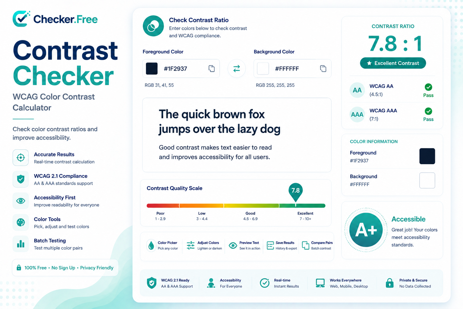
What Is a Color Contrast Checker?
A color contrast checker measures the difference between a foreground color and a background color.
For example, it can be used to evaluate:
Text against a page background
Button text and button backgrounds
Links
Input borders
Focus indicators
Icons
Charts and graphical elements
Labels and interface components
Checker.Free calculates the contrast ratio between the selected foreground and background colors and compares the result with accessibility thresholds.
The workspace provides real-time contrast calculations and includes both WCAG ratio results and an APCA estimate for additional design insight.
Why Color Contrast Matters
Poor contrast can make information difficult to read, especially for users with reduced visual acuity or color-vision deficiencies.
A common example is light gray text placed on a white background. Although the color may appear subtle and modern, it can produce insufficient contrast for normal body text.
Good contrast is therefore not only a visual design preference. It is an important part of making digital interfaces easier to read and use.
WCAG Contrast Requirements
The Checker.Free Contrast Checker evaluates color combinations against commonly used WCAG 2.1 and WCAG 2.2 contrast requirements.
For Level AA:
Normal text requires at least 4.5:1.
Large text requires at least 3:1.
Important non-text user-interface information generally requires at least 3:1 against adjacent colors.
For Level AAA:
Normal text requires at least 7:1.
Large text requires at least 4.5:1.
The tool presents separate results for normal text, large text, and UI components so that a color pair can be evaluated according to its intended use.
What Counts as Large Text?
WCAG defines large text as text that is at least 18 points (24 CSS pixels), or at least 14 points (approximately 18.66 CSS pixels) when the text is bold.
This distinction is important because large text has different minimum contrast requirements from normal body text.
Check Foreground and Background Colors
The main workspace provides separate controls for:
Foreground / Text Color
This is the color used for text or another visual element.
Background Color
This is the surface behind the foreground element.
Colors can be entered as HEX, RGB, or HSL values, while the interface also provides color pickers and additional controls for adjusting lightness and opacity.
Once the colors are selected, the workspace calculates the contrast ratio and provides a visual status showing how the combination performs against the relevant accessibility targets.
Contrast Ratio: From 1:1 to 21:1
The standard WCAG contrast ratio is calculated using relative luminance:
(L1 + 0.05) / (L2 + 0.05)
where L1 is the relative luminance of the lighter color and L2 is the relative luminance of the darker color.
The resulting ratio ranges from 1:1, when the colors are identical, to 21:1, representing the maximum contrast between black and white.
This provides a numerical way to compare color combinations instead of relying only on visual judgment.
Test More Than Text
Accessibility does not stop at paragraphs and headings.
Interface components can also need sufficient contrast, including visual information used to identify:
Buttons
Input boundaries
Focus indicators
Component states
Standalone icons
Meaningful graphical objects
The Contrast Checker includes a dedicated UI Components & Icons section to help evaluate these requirements.
Live UI Preview and Typography
One of the useful parts of the workspace is the Live UI Preview & Typography section.
Instead of looking only at a numerical ratio, you can inspect how a color combination behaves across common interface elements such as:
Headings
Paragraphs
Buttons
Links
Badges
Input fields
Select controls
Checkboxes
Radio buttons
Code blocks
Information messages
This makes it easier to see the practical effect of a color choice on an interface rather than evaluating colors in isolation.
The workspace also provides typography controls for testing readability in a more realistic UI context.
Brand Palette Explorer
Design systems often contain many brand colors, making it difficult to test every combination manually.
The Brand Palette Explorer helps designers inspect colors from a brand palette and explore their possible foreground and background combinations.
You can add HEX colors to the palette and inspect how those colors perform when used together.
This is particularly useful when creating:
Design systems
Brand guidelines
UI color tokens
Website themes
Application interfaces
Batch Pair Auditor
Checking one color combination at a time can become inefficient when a project contains dozens or hundreds of color tokens.
The Batch Pair Auditor is designed for this situation. It allows multiple foreground/background pairs to be entered together and audited in bulk.
The tool can then provide an overview of the tested combinations, making it easier to identify pairs that require adjustment.
The batch results can also be exported as a CSV file, which can be useful when working with larger design-system audits.
Text Over Gradient Analyzer
Gradient backgrounds create a special accessibility challenge because the contrast can change from one part of the background to another.
A text color might have excellent contrast at one point of a gradient and insufficient contrast at another.
Checker.Free's Text Over Gradient Analyzer calculates:
Worst-case contrast
Average contrast
Best-case contrast
This is useful when evaluating hero sections, banners, cards, and other designs where text is placed over gradients.
For gradients and photographic backgrounds, checking the lowest-contrast area is especially important because an average ratio alone may hide a problematic region.
Color Blindness Lab
Color accessibility is not only about luminance.
Two colors can have an acceptable contrast ratio while still becoming difficult to distinguish when their hues are altered by color-vision deficiencies.
The Color Blindness Lab provides simulated views for different forms of color-vision deficiency, helping designers examine whether important information remains understandable.
This is especially useful for interfaces that use red and green to communicate success, errors, warnings, or status.
WCAG also states that color should not be the only visual method used to communicate important information. Icons, text, patterns, or other visual cues can provide additional distinction.
APCA: An Additional Contrast Measurement
The workspace also provides an APCA estimate.
The Advanced Perceptual Contrast Algorithm is a different approach to evaluating perceived lightness contrast. Unlike the traditional WCAG ratio, APCA considers factors such as font size and weight and produces an Lc score.
However, APCA should be treated as an additional design measurement rather than a replacement for the official WCAG 2.x contrast requirements. The standard WCAG relative-luminance ratio remains the compliance benchmark described by the tool.
Auto-Fix Failing Colors
Finding a failing color combination is only the first step.
Checker.Free includes automatic adjustment options for:
Fix for AA (4.5:1)
Fix for AAA (7.0:1)
These controls can adjust a color toward an accessibility target, helping designers find a usable alternative more quickly.
However, an automatically adjusted color should still be reviewed for brand consistency, visual hierarchy, and overall design quality.
Light Mode and Dark Mode Should Be Tested Separately
A color palette that works well in light mode may not automatically work in dark mode.
The same colors can behave very differently when their surrounding surfaces change. For this reason, accessibility testing should be performed independently for both themes.
The workspace can be used to inspect color relationships across different interface conditions, helping designers avoid relying on simple color inversion.
Focus Indicators and Interactive Components
Keyboard focus indicators are another area that can easily be overlooked.
A focus outline needs to remain visually distinguishable from the surrounding interface. WCAG guidance includes requirements concerning the contrast of visual information that identifies component states.
The Checker.Free workspace specifically includes focus and input-border checks as part of its UI component analysis.
Why Gray Text Often Fails Accessibility
Modern interfaces frequently use muted gray text for secondary information.
Colors such as very light gray can look subtle on a white background but may produce contrast ratios well below the 4.5:1 Level AA requirement for normal text.
This is one reason accessibility audits often identify secondary labels, captions, metadata, and placeholder-like text as problem areas.
Testing these colors with the Checker.Free Contrast Checker can reveal whether a seemingly minor color choice actually meets the required contrast level.
Color Contrast Is Only One Part of Accessibility
Passing a contrast test does not automatically make an entire website accessible.
A complete accessibility review can also involve:
Keyboard navigation
Focus management
Screen-reader accessibility
Accessible names
Responsive text reflow
Target sizes
Text alternatives
Appropriate semantic HTML
Color contrast should therefore be considered one important part of a broader accessibility strategy.
Build Better Color Systems
For larger projects, it is useful to think about colors in terms of semantic roles rather than simply storing a collection of HEX values.
For example, a design system can define tokens such as:
text-primarytext-mutedsurface-canvasborder-interactivefocus-ring
This approach makes it easier to audit color relationships consistently across components and themes.
The Checker.Free workspace also includes a CSS & Design Tokens section for working with these color definitions.
Who Can Use the Contrast Checker?
The tool can be useful for many types of users, including:
Web designers
UI/UX designers
Front-end developers
Accessibility specialists
Design-system teams
Brand designers
Agencies
Website owners
Developers reviewing existing interfaces
Whether you are checking one text color or auditing an entire design palette, the workspace provides several ways to approach the task.
Explore the Checker.Free Contrast Checker
You can start testing your colors with the Color Contrast Checker.
You can also explore other tools available on Checker.Free, including the Resolution Checker, Dead Pixel Checker, Refresh Rate Checker, and other diagnostic utilities.
For more information about Checker.Free, visit the Privacy Policy, Terms, or Contact pages.
Comments
Post a Comment